
Problem: The trial signup page was seeing a high drop-off rate
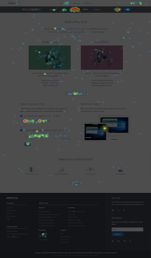
RealVNC offered a 30 day free trial of its VNC Connect software. There was a clear call to action on the homepage, but the subsequent sign-up page was seeing a fairly low conversion rate.
Working with our Marketing team, we set up a Conversion Rate Optimisation (CRO) tool to give us some baseline metrics.
After noticing that many users were not engaging with the content on the page, I proposed that we run an A/B test with an alternative design.
Usage maps gave insights into behaviour
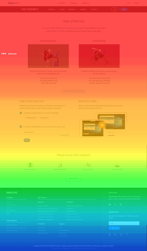
A heatmap and scrollmap generated some good insights into how visitors were using this page.
The heatmap shows little engagement with the videos at the top of the page, and the scrollmap shows that not everyone managed to scroll down and find the sign up form.
There were plenty of other interesting things going on, like the huge hotspots over “Download” and “Try it” in the top navigation, which possibly indicates that people didn’t want to sign up, but rather download the software first.
Unfortunately, the scope of this project only allowed some minor content changes. So that stone remained unturned.
A/B testing provided convincing metrics
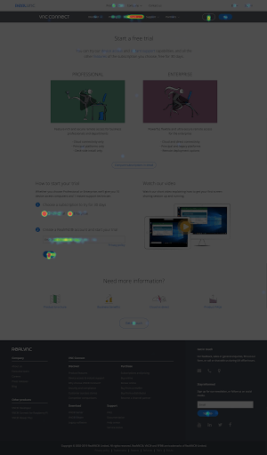
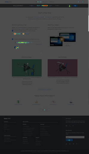
Our Marketing team were very keen not to lose their videos from this page, so we did a simple swap and put the sign up form above the videos.
We ran the test for a week and saw that clicks on the form submission button had roughly doubled, both in terms of number of clicks, and percentage of clicks on the page.
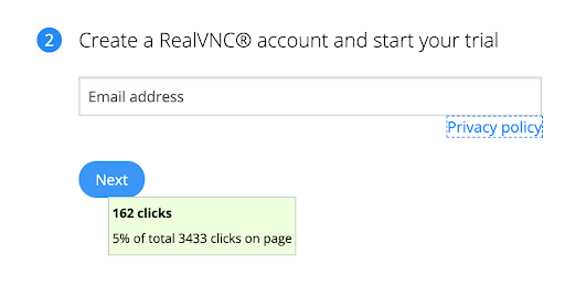
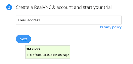
This was enough to convince the Marketing team to make the change permanent.
This was a low-effort exercise that showed how design could affect user behaviour. I’d like to have run some qualitative tests too, but was happy to have built some trust with the Marketing team. To be spent wisely.
