
Creating a Playful, Trusted, and Clear Banking Experience
Using layouts, colours, typography and iconography, I developed high-fidelity responsive designs for a new digital banking website, ensuring a seamless and engaging user experience.
The Challenge
A new challenger bank needed an intuitive, visually distinct online presence to set itself apart from traditional financial institutions. The goal was to design an interface that reflected the brand’s core values: clarity, playfulness, and trustworthiness.
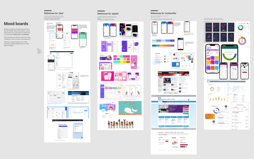
Research & Inspiration
To establish a strong design foundation, I began by:
- Competitive analysis – Examining existing banking apps and digital products that aligned with the design brief.
- Mood boards – Gathering visual inspiration from brands that successfully balanced professionalism with approachability, such as Monzo and Slack.
- Grid & layout exploration – Experimenting in Figma to create a structured yet flexible framework that adapted across devices.
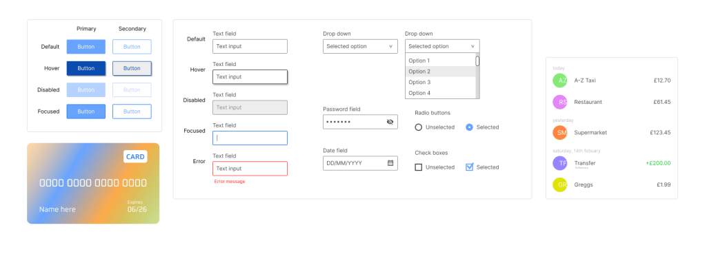
Design Development
With a clear direction, I focused on key UI elements:
- Grid System & Layout – Implemented an 8pt grid with 12, 8, and 4-column layouts for desktop, tablet, and mobile, ensuring consistency and responsiveness.
- UI Components – Designed essential components such as buttons and form fields, considering various states and accessibility requirements.
- Typography – Selected Montserrat for headings and Open Sans for body text, creating a balanced typographic hierarchy optimised for digital interfaces.
- Colour Palette – Chose a modern yet subdued colour scheme inspired by vibrant, trusted brands to convey playfulness without overwhelming the user.
- Iconography – Used simple, recognisable icons for navigation while incorporating unique, playful illustrations sparingly to add character.
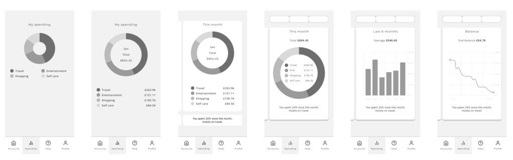
Iteration & Refinement
After assembling core design elements, I quickly iterated on screen layouts, focusing on usability and visual appeal. Throughout the process, I prioritised efficiency and flexibility, avoiding attachment to any single design too early.
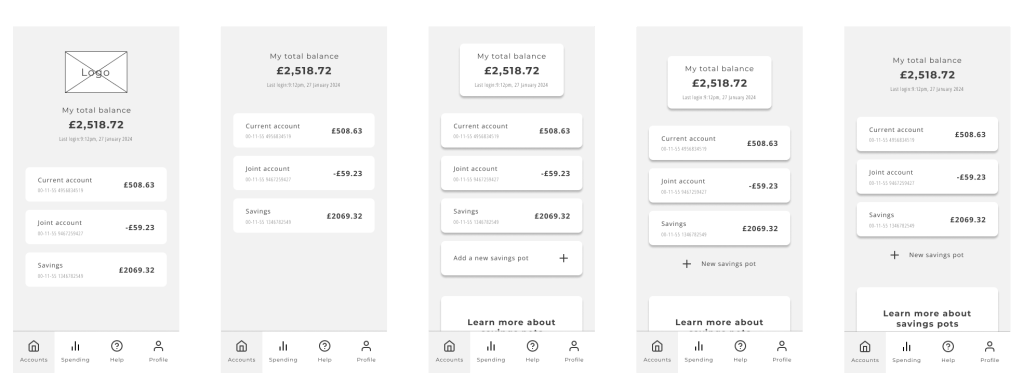
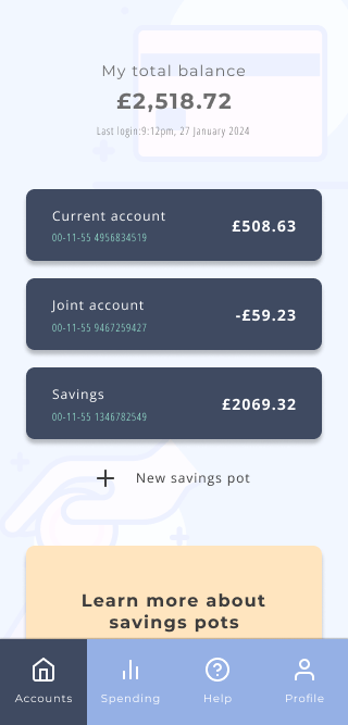
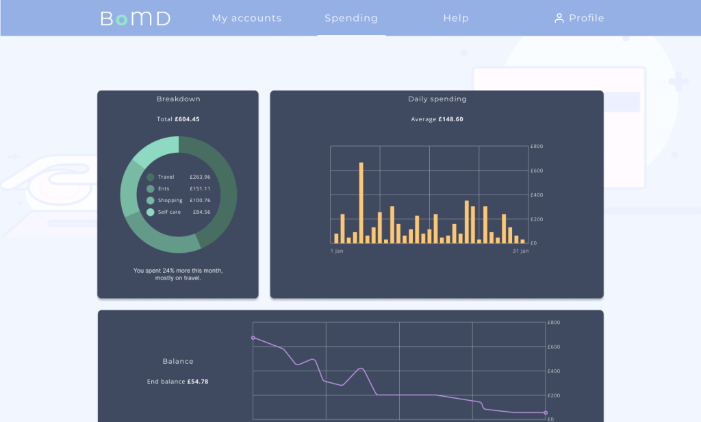
Final Designs
With layouts refined, I introduced the full colour palette, polished icons, and adjusted typography for a cohesive and engaging user experience. While no design is ever truly “final” in a real-world setting, continued collaboration and feedback would further enhance and fine-tune the UI.

This project demonstrated my ability to merge aesthetics with functionality to create intuitive, visually appealing digital experiences.
